The color of a button, the empty space around a headline, and the angle your eye takes across a page — they’re not random. This article dives into the psychology of web design and explains how colors and layouts steer attention, shape trust, and nudge action. Read on for research-backed insights, practical rules you can test today, and a few playful metaphors so the design advice doesn’t read like a dry manual.
Why color matters (more than you think)
Colors act like tiny mood signposts. They trigger emotions, influence perceived value, and speed up recognition. Research on color in marketing and UI shows that first impressions are largely visual: a user forms an opinion about a website’s credibility within 50 milliseconds. For a deep dive on color psychology and UI best practices, see the Interaction Design Foundation’s guide.

Contrast, accessibility, and trust
Color isn’t just pretty — it’s functional. Poor contrast creates cognitive friction and hurts readability for all users, especially those with visual impairments. The WebAIM contrast guidelines explain the WCAG contrast ratios you should aim for. Accessibility isn’t a chore; it’s a trust accelerator: sites that are easy to read feel more professional and dependable.
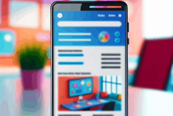
How layouts direct the eye — the F-pattern and beyond
Users don’t read web pages like novels. They scan. The famous F-shaped pattern shows how visitors sweep across headlines and the top-left area first. Use that behavior to your advantage: place your most important content, value propositions, and CTAs where the eye naturally lands.
Data-driven design: testing, heatmaps, and real case studies
Gut feelings are fun, but numbers win. Use A/B testing, session recordings, and heatmaps to validate color choices and layout tweaks. For example, marketers and UX teams commonly test CTA color and placement — HubSpot and other teams have published practical conversion tests showing meaningful uplift from simple color or copy changes (try a controlled A/B experiment rather than trusting a rule of thumb). For checkout flow drops, see Baymard Institute’s cart abandonment research, which quantifies the cost of friction.